
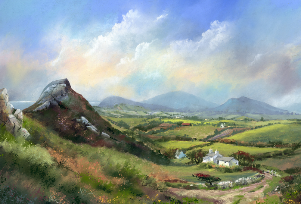
In the above image, which is an enlarged part of a painting that I am currently working on for an exhibition in Tenby this spring, the strong light increases the contrast between different planes making it easy to make the rocks look three dimensional. The light faces are defined with a soft transistion of lighter tones and some darker fracture lines, rendered with a sharp charcoal pencil.
It is also important to study the random shapes of rocks. If you make all your rocks the same size and shape and uniformly spaced they will look man-made rather than natural. Of course the best way to improve your rocks is to go out sketching and make some careful studies. Or, if rocks are conspicuous by their absence where you live, gather a pile of randomly shaped stones and make a detailed pencil study in your studio. Even this should help you to understand the play of light and shade and the random nature of their shapes.
If you want to join me on my painting course in Lynmouth, North Devon in May I will be sketching and painting rocks, cottages, trees and water. North Devon has some beautiful scenery and we shall be well looked after by Cheddar Painting Holidays
Thanks so much for your tips. Now to go out and practice
ReplyDeleteHow do you liven up a painting where there is little change in the rock color, which also happens to be a brownish-red. It's really a pretty little vignette, but the bank is a tan-red, the rocks are an Alabama red, the soil they're sitting on is a cream with red undertones. The water reflects the brownish-red of the rocks. It's just a bit much red for me! I used greens and burgundies for the foliage. I guess I could change the water color, just to brighten it up a little bit. Thanks for any suggestions you might offer. Betty Smith
ReplyDelete